If I cut to the chase, yes, rotating carousels kill conversions. Undoubtedly many of you love your carousels. It’s the novelty of having a moving image on the homepage, the ability to stack loads of information into one small space, and they make your website look good… Right?
The purpose of this article is to provide you with an understanding of the role of design in the conversion funnel. So here is my top three “ah -huh’ moments that will identify why your friendly banner could be killing your conversions. And as a true data nerd, I’ll give you the data to back it up.
1) Banner Blindness
A phenomenon where users ignore any image that is flashing, moving or blinking. Why? We have now conditioned ourselves to ignore them because we think they’re advertisements. And 9 times out of 10, they are.
Like so:

Unless you are someone that really wanted that “free” laptop that you “won”, most of us skim right past or even leave the page. This same principle can be applied to your carousel – flashing images of different products and promotions on your homepage is an instant signal to your website visitors that it’s an advertisement and can be safely ignored. While you may think that those promotions are awesome, visitors to your website might not care at all. And now you’ve wasted prime visual real estate on useless ads that don’t move visitors any closer to purchasing.
To quote Jakob Nielson (yes, that Nielsen) from a research study they conducted:
“We simply confirmed for the umpteenth time that banner blindness is real. Users almost never look at anything that looks like an advertisement, whether or not it’s actually an ad.”
In fact, the average CTR for banner ads as reported by Google was at .089% (with sharp seasonal increases during the Christmas period).
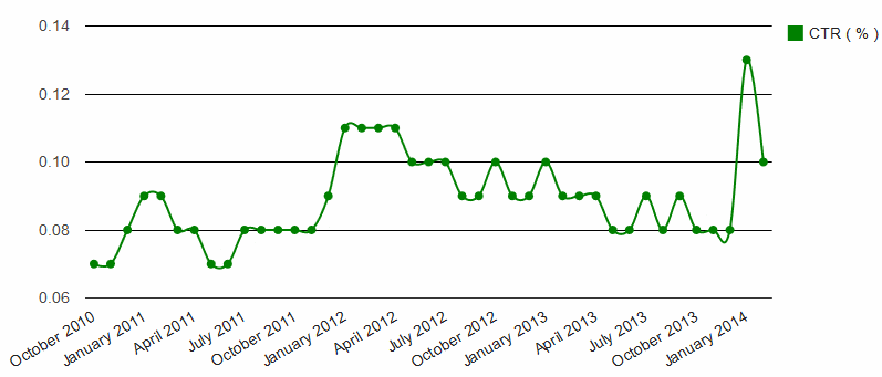
Google DoubleClick Display Benchmarking Report, U.S., All Verticals, All Formats, Feb 2014-Oct 2010
And that takes me to my next ah-huh moment:
2) The 5 Second Test
The 5 second test is essentially a relevancy test. Within 5 seconds of visiting your website, a visitor should be able to answer these three questions:
- Who are you?
- What product or service do you provide?
- Why should I care? (i.e. what’s in it for me)
Generally users will follow the visual hierarchy of the website and look at the logo, main navigation and header image to gain an understanding of what your website is about. If you’re hiding your messaging in rotating banners a user will only see one of your banners and, depending on the content and speed of your banner rotations, might not even have time to absorb the entire message.
5 seconds seems short, but it’s worth noting that on average, a user will spend 10 seconds on your website. That’s because first impressions last a lifetime, and most websites don’t pass the 5 second test.
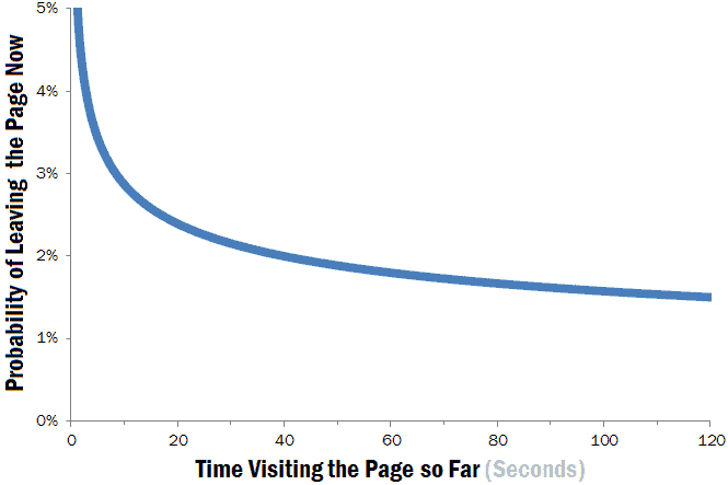
The below chart is from a study done by Microsoft and published by Nielsen Norman Group. It shows the likelihood of a user leaving a website within two minutes of arriving.
As Jakob Nielsen himself puts it:
“It’s clear from the chart that the first 10 seconds of the page visit are critical for users’ decision to stay or leave. The probability of leaving is very high during these first few seconds because users are extremely skeptical, having suffered countless poorly designed Web pages in the past. People know that most Web pages are useless, and they behave accordingly to avoid wasting more time than absolutely necessary on bad pages… To gain several minutes of user attention, you must clearly communicate your value proposition within 10 seconds.”
In short, using up most (and sometimes all) of your homepage real estate is a huge waste of valuable resources and offers little-to-no value to consumers.
It’s also worth asking yourself – if you’re hiding content on your second, third or even fourth banner, is it really that important…?
3) Usability
Usability is the degree to which a website can be used by consumers to achieve quantified objectives with effectiveness, efficiency, and satisfaction in a quantified context of use.
Now some of you love your carousel, so as a compromise, us conversion experts suggest at the very least giving the user control of the banner. By removing the auto-scroll function and adding manual navigation arrows, you allow the user to actually process the content on the first banner and, if they’re interested, check out the other banners in the carousel.
Another thing to consider is having a single banner instead of multiple banners. Invest in a single banner with a single message, your amazing USP and a strong call-to-action that pushes visitors deeper into the conversion funnel. That’s the recipe for a good user experience.
My honest advice going forward, KIS. That’s right – “Keep it Simple”. Don’t over-engineer your messaging and design.
Consumer preferences vary across different industries and product categories, and shopping behaviours vary across different countries. What I would suggest from here is trying a tool like Hotjar or Lucky Orange, where you can set up a heatmaps and sessions recordings on your homepage. Pair that with some quantitative data from Google Analytics and you’ll see exactly what type of engagement your carousel is getting, and exactly how much prime territory you’re wasting. There’s nothing like a bit of data to show you the light.